Expand your business in the UK
Department for Business and Trade
My role
Across the service, I was responsible for:
interactive content design
UI microcopy
static content
information architecture
Key challenges
Multiple rounds of user research interviews with businesses decision-makers around the world highlighted several issues affecting usability and trust:
Perceived double signup
Users answered all the questions only then to be asked to sign up to unlock content. Guidance articles were displayed with padlocks icon over them, and many users expressed their frustration with this in research.
Unclear value exchange
Users didn’t understand what information they would receive after completing the questions and sign up.
Content overload
The service prioritised big chunks of generic guidance text over tailored information, burying more relevant content in a secondary tab that users often missed. And a key in-person service: ‘find a UK lawyer, find a UK accountant’ did not feature in the guidance landing pages.
Friction for international users
The UI assumed UK knowledge and conventions – for example, investment amounts in GBP only, and a hard-to-find ‘I don’t know’ option for selecting a UK location. This led users with limited knowledge of UK geography to make random selections just to progress.
What I did
Established clarity and transparency around signup
I worked with the interaction (product) designer to move signup to the beginning of the journey, creating a new start page that clearly explained what users would receive. I wrote microcopy and calls-to-action that were direct, transparent and confidence-building, making early signup feel purposeful rather than obstructive.
Devised and delivered the concept of a ‘dynamic guide’
To address content overload, I developed and successfully pitched the idea of a dynamic guide to product leadership and stakeholders. The feature is a dashboard-style page combining tailored information (based on a user’s earlier answers) with essential general guidance. I co-designed the business logic for what should appear when, and rewrote the entire content set to be clearer, more action-oriented and easier to scan.
Improved usability for an international audience
I designed smaller but high-impact UI changes – for example, adding a currency selector (initially USD and EUR) to reduce friction.
EYB is a service for foreign business decision-makers exploring expansion into the UK. It asks users a series of questions to score and assess the investment potential of their project. Depending on the outcome, users are either routed to an investment adviser for a one-to-one follow up (lead generation) or to self-serve guidance only on how to set up in the UK.
Design decisions and process
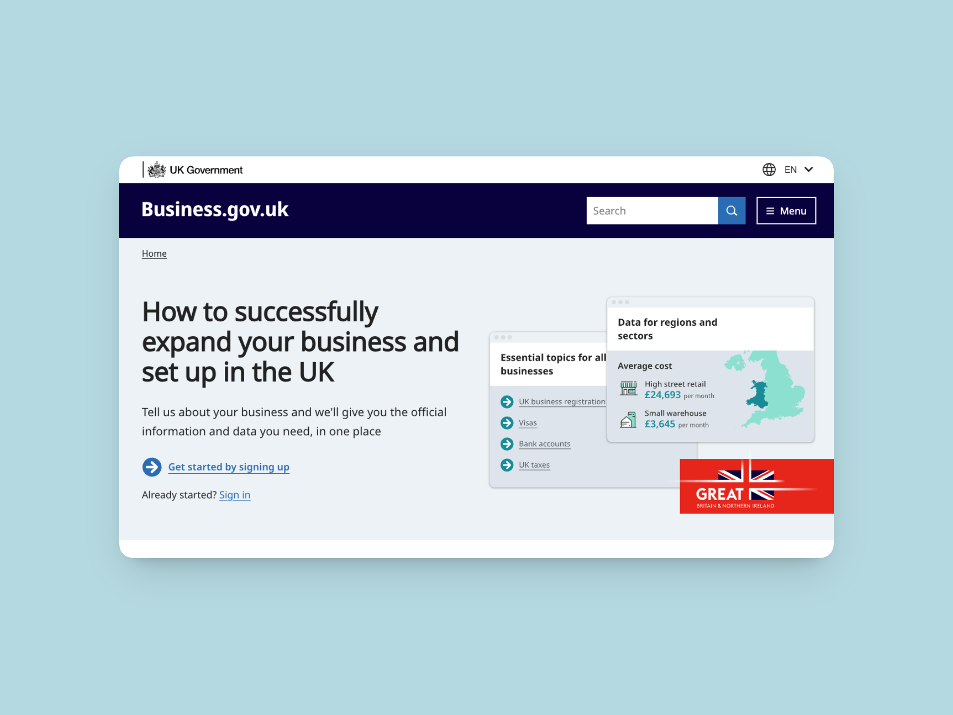
A new start page
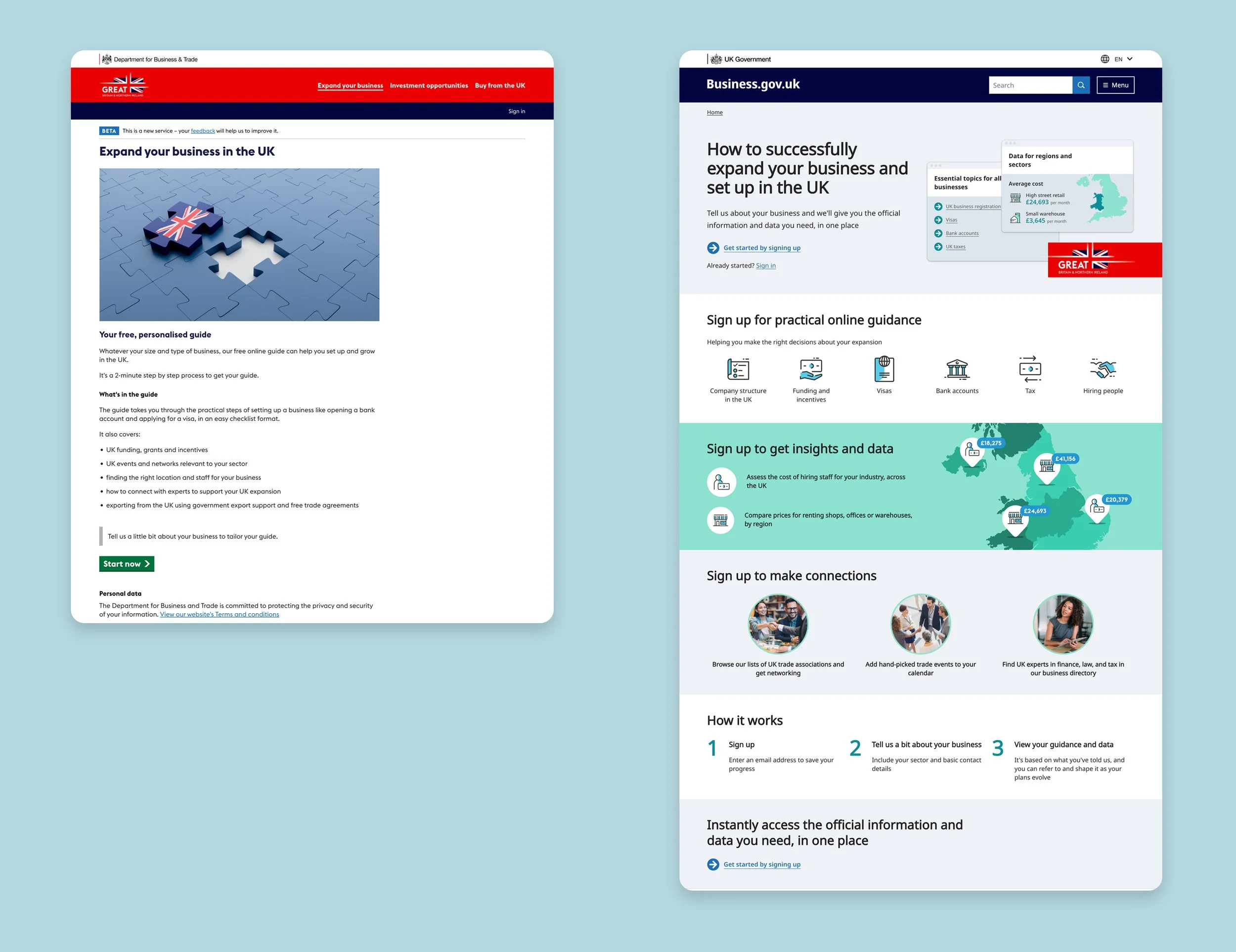
⏪ Before and after ⏩
The product team and stakeholders made a decision to experiment with moving the signup to the front of the service, to the start page. This was to address the ‘double signup’ issue, resolve signup loopholes and strengthen the concept of a profile-based journey – saving your answers, with the ability to change details later as plans change.
This meant that the start page would need to work much harder to persuade users to create an account at the start. It would need to be much more informative and explanatory about what the service would provide.
I advocated for informative icons and stylised screenshots, so that the page would really shout out ‘data’. Based on research interviews, I knew that ‘speaking to a person’ was one of the most common desires, so proposed a section that would highlight the human elements of the service, and frame it with active language ‘browse associations, add events, find experts’.
I employed repetition for emphasis and clarity: ‘sign up for practical guidance’, ‘sign up to get insights’, ‘sign up to make connections’. I also shifted the framing and language away from ‘get your personalised guide’ towards ‘tell us about your business and get data’.
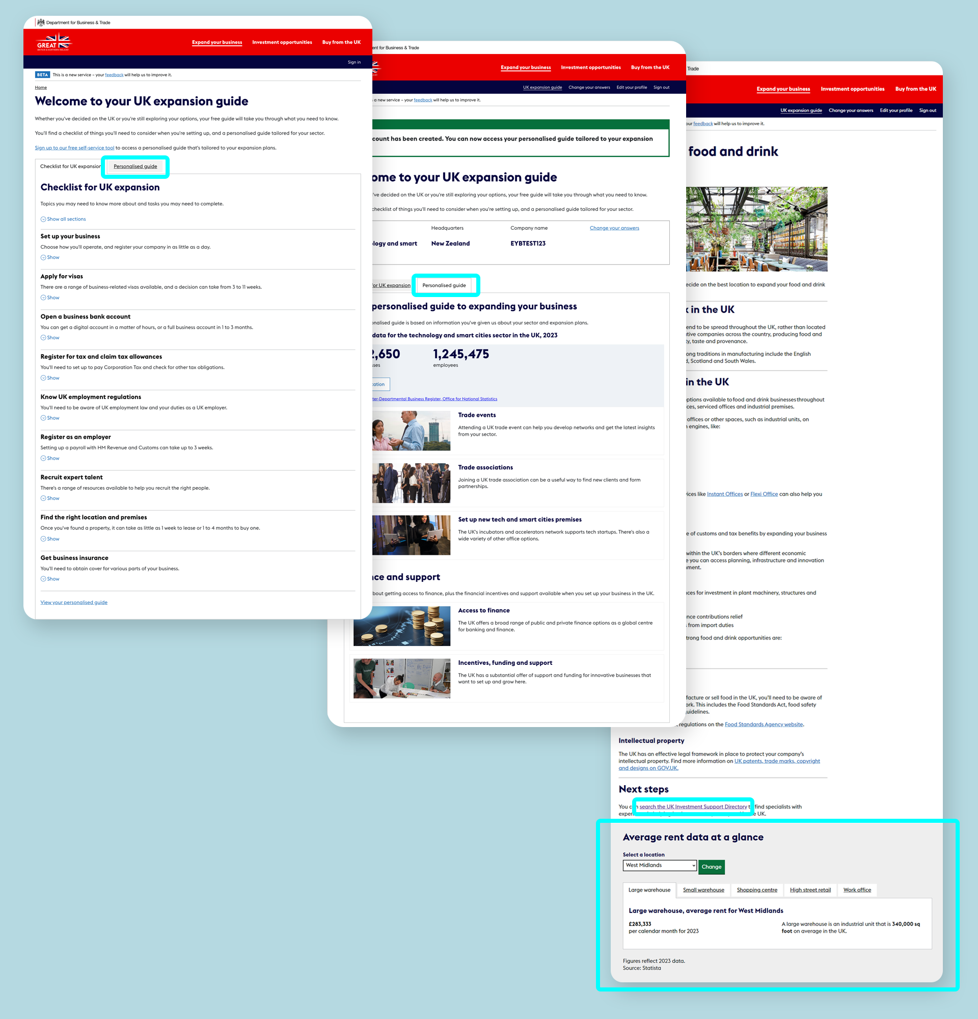
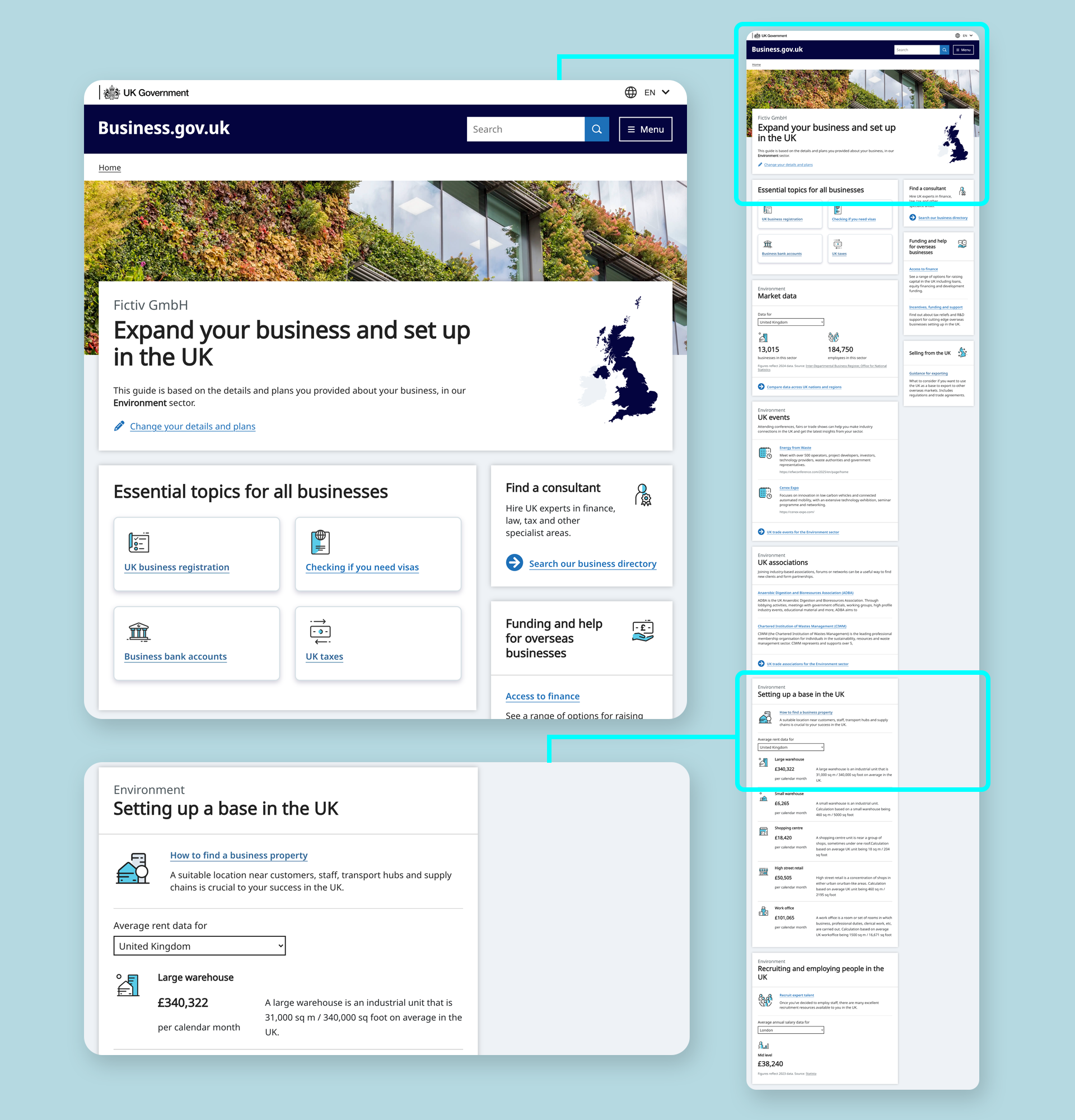
Dynamic guide
I merged the content from two distinct screens – a checklist of steps for all businesses, and a sector-specific overview – into a single dynamic guide.
Working closely with an interaction designer, we co-designed the page grouping and hierarchy to make the long page scannable and intuitive. Discovery insights were mapped into a Mural board to justify ordering decisions and prioritisation, which also doubled as our design sandbox (excerpt below).
Research interviews showed users were often unclear about what was actually personalised. The sector-specific overview was headed ‘Your personalised guide to expanding your business’. I advocated for a ‘show, don’t tell’ approach, using visible indicators such as displaying the user’s company name at the top of the page.
I explored incorporating sector and UK region into the heading, but this didn’t scale well and often produced awkward phrasing. I instead landed on a simpler solution: a sector-relevant header image and a map with the chosen region shaded. As around 80% of users didn’t select a region, the map usually defaulted to the whole UK, replacing explanatory text with clear visual cues.
Lastly, me and the interaction designer were very keen to replace stock photography with icons. The photos made articles feel like blog posts, while icons aligned with global investment promotion sites and improved scannability for international audiences.
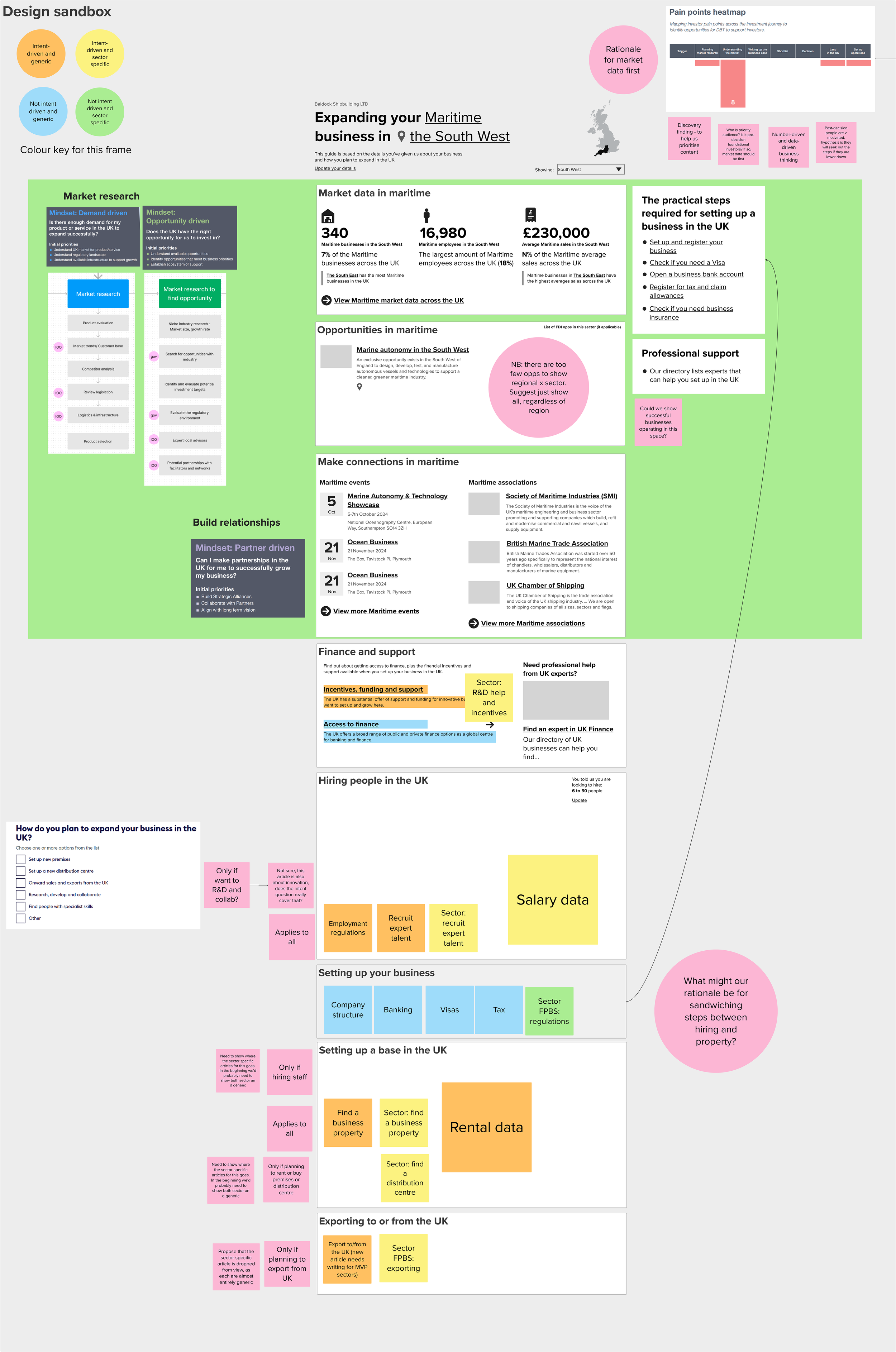

As part of validation for the dynamic guide design, I also did an analysis that mapped 25 sectors against content availability (sector-specific articles), to identify gaps and overlaps. Then I applied conditional display logic to balance generic and sector-specific information, ensuring the guide could adapt dynamically to varying levels of content completeness.
⏪ Before
The EYB guide content was spread across two tabs and a component at the bottom of articles. A key piece of information (a directory for finding consultants) was also frequently overlooked, as it was accessible only via link text buried deep in the page.
⏩ After
All the guide content is in a single view, with ‘need to know’ popular topics front and centre. The directory for finding consultants has been brought to the fore, reframed, given a description and an icon. Rental and salary data have been pulled out of articles and into a dashboard view.
Simpler conversion
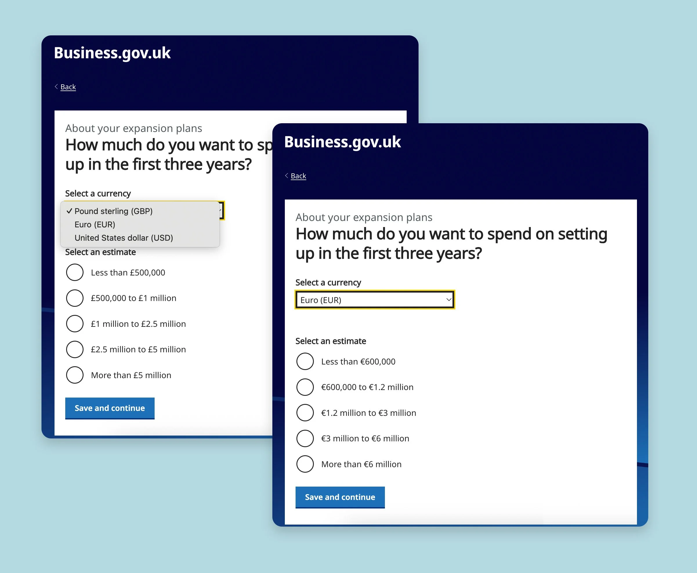
When I joined the EYB team, I noticed that the question about planned UK investment spend was presented only in GBP. Research interviews showed users struggling with mental currency conversions or saying they’d leave the service to check a currency site. Complex solutions such as live conversion were proposed.
As a newbie, I spotted a simpler opportunity, one using words rather than tech. The purpose of the question meant it didn’t need precise conversions. I proposed a dropdown with estimated ranges in EUR and USD to cover most contexts, alongside simplified question phrasing and clearer figure display, including removing the ‘specific amount’ option.
In a later iteration, I paired with the developer responsible for the scoring algorithm to further refine the ranges. We reduced the number of options and made them more relatable, informed by statistical analysis and standard range-formatting conventions.

⏪ Before

⏪ After
Impact and outcomes
Start page
After the new start page went live, with signup moved forward, average monthly signups increased by over 250%. Median signups more than tripled, pointing to sustained improvement rather than a one-off spike. It was a better result than anticipated, as asking users to sign up before seeing any content was a risk.
While other factors may have contributed, the timing and consistency of the uplift (over at least seven months) suggest the redesigned page played a significant role in improving signup.
Dynamic guide
For the dynamic guide, designing the missed tab out meant it was no longer possible for sector-specific content to be hidden from users. The flexible design allowed for 17 out of the 25 sectors, with little or no long-form guidance content (some of these were in progress) to display a cohesive dashboard style view, with available data and investment opportunities pulled in.
Currency dropdown
The redesigned spend question page reduced the number of options from seven to five, removing friction for users. In follow-up research interviews, international users were consistently able to find and use the dropdown intuitively, selecting a currency that matched how they wanted to budget.