Child birth grant
The Child Birth Grant is a one-off payment of approximately €600 (at launch) provided to mothers in Cyprus following the birth of a child. Users authenticate using the government’s central digital ID and single sign-on service, which enables verification against social insurance and civil registry records to determine eligibility. Payment is made directly to the applicant’s bank account.
The service was previously paper-based and was selected as the first to ship from Cyprus’s new digital government agency, Digital Services Factory. It was delivered by a blended DSF-GDS team in Greek and English.
Government Digital Service, UK + Digital Services Factory, Republic of Cyprus
My role
I was responsible for all interactive and informational content design in English, as well as leading on agile comms such as blogs and presentations. As part of my role at GDS and its co-delivery remit, I was also tasked with training a Cyprus-based civil servant to become a content designer in DSF, to build capability and a knowledge base in Greek.
Key challenges
Complex rules
Eligibility was based on having given birth and meeting social insurance contribution levels across defined periods before the birth. Applicants needed to qualify across multiple contribution windows, making eligibility difficult to assess upfront. The service also had to support varied scenarios – including partner contributions, single mothers, overseas births, and stillbirths. Because these rules are fixed in law in Cyprus, the complexity had to be clearly explained or carefully designed around.
System-led to user-led pivot
The blended team was learning user-centred design from scratch, including using research to drive decisions and building a design system concurrently. GDS was introducing these practices to highly technically experienced DSF colleagues. As an illustration – forms had previously been created in isolation, using language drawn directly from backend systems rather than user needs.
Dependency-heavy journeys
The service relied on multiple system integrations to reduce user input and manual checks. Where integrations succeeded, the experience was fast and low-effort; where records were missing or mismatched, clear fallbacks and error content were essential. Designing for both success and failure paths was critical to maintaining trust in a verification-led journey.
What I did
Designed a clear, confidence-building start page
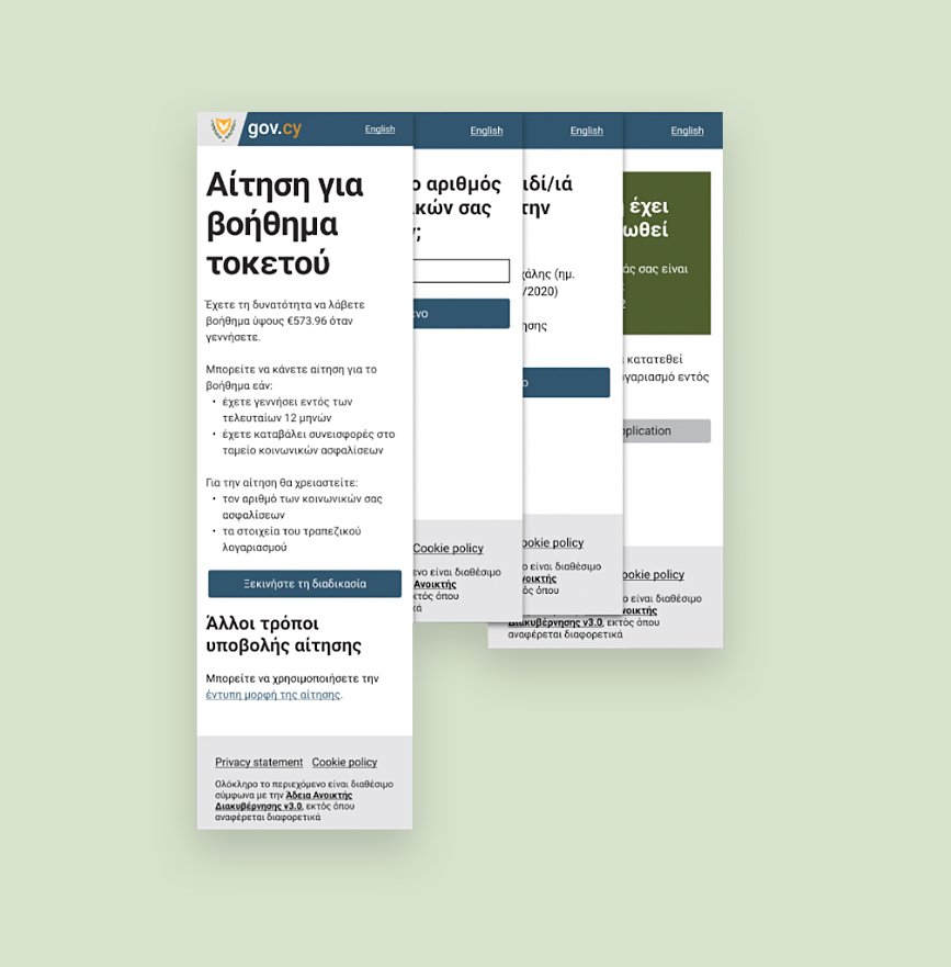
I designed an introduction to the service that gave users just enough information to understand the service and decide whether to proceed. I led the decision to surface the grant amount up front, followed by a simple explanation of who the grant was for and what users would need to apply and receive payment. This was a deliberate contrast to the paper process, which led with legal warnings. I ensured the approach was strongly grounded in GOV.UK start-page principles, which prioritise clarity, brevity and avoid excessive detail – the questions in the service will help determine a user’s eligibility.
Built user-centred design capability in a new team
I trained and worked closely with a newly appointed content designer in DSF who had no prior experience in content design or technology. I recognised early on that this was an advantage rather than a constraint, as she brought strong instincts for plain language and user advocacy without legacy practices to unlearn. Through structured training and intensive co-design from the outset, I built her confidence and capability, enabling her to operate as a credible user-centred design advocate within the team, with a foundation to champion these practices more widely across digital government in Cyprus.
Clarified outcomes for complex and edge-case journeys
I worked closely with service designers to understand the service’s detailed business rules and identify where users could not complete the digital journey. Together, we defined clear stop pages and alternative routes for more complex cases that required supporting documents and were out of scope for MVP. I wrote content that was transparent and empathetic, translating rules into clear onward journeys without exposing users to the underlying complexity. I also clearly distinguished between straightforward ineligibility and cases where records could not be found, ensuring users were given the benefit of the doubt and clear next steps.
Design decisions and process
Learning from the start
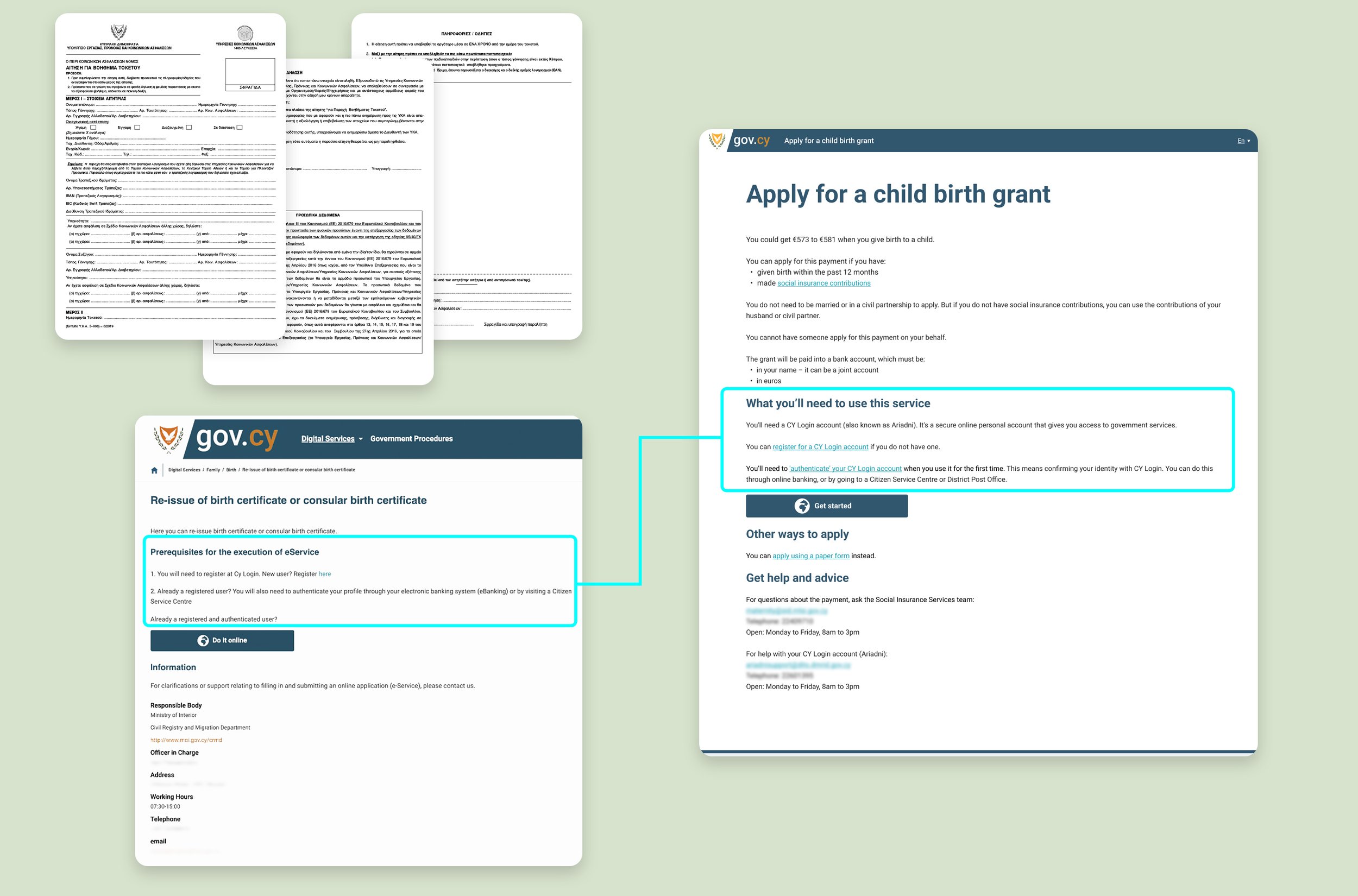
⏪ Top left: the paper form (in Greek, but amount of upfront burden on the user can be observed regardless of language)
⏪ Bottom left: legacy wording
⏩ Right: the finalised start page, with redesigned SSO instructions
Designing the very first page of the team’s very first service was the beginning of a big shift in approach. As such, almost every word of the start page was contested and discussed in depth – and it represented a steep learning curve for everyone involved.
For example, one of the stakeholders felt strongly in favour of using wording from another service that had been digitised by a predecessor team. The wording explained that users needed a government SSO account to use the service, and steps needed to authenticate it. But the copy was a clashing mix of bureaucratic language: ‘Prerequisites for the execution of eService’ and informal interrogative: ‘New user?’ ‘Already a registered user?’
My approach was to gently emphasise to the stakeholder the importance of clarity for users above all else. I gave a clear rationale on why both formal and informal language could be ambiguous and abstract, just for different reasons. I then designed alternative text which was direct, functional and in active voice – users just want to know what they need to do. The stakeholder was happy with this and the wording was adopted.
I had learned from an early round of research that users wanted to know the grant amount – very understandable. So I used this finding as a way to introduce ‘frontloading’ to the DSF designers, bringing the most important information to the top of the page. In this case it’s simply: you can get ‘x’ amount of money when you have a baby.
Driving bilingual design
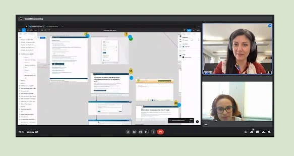
⏩ A typical co-design Figma session with my counterpart, Elpida.
I worked closely with my DSF colleague – whose strength in both English and Greek complemented my content design approach, creating a strong exchange of skills from the outset. A key early decision was how to design and deliver bilingual content effectively.
We agreed that translation was not the right approach (a DSF blog piece details why). We also committed to designing together daily, managing the two-hour time difference between me in the UK and her in Cyprus. Initially, I designed in English with counterpart shadowing, then she produced the Greek version, which was reviewed by Greek-speaking UCD colleagues. This often surfaced new issues, requiring reworking in both languages. I proposed iterating the workflow to co-design in both languages simultaneously and gather feedback in parallel, which proved far more efficient.
During bilingual user research, I identified confusion around the English term ‘stillborn’, while the Greek equivalent was clearly understood. I led the analysis and used this finding to shape our content approach. It highlighted the need to design English for non-native speakers, and that some users switch between languages to aid comprehension. In co-design work with my DSF colleague, I learned and absorbed that direct phrasing can work in Greek but can feel harsh in English, requiring restructuring rather than translation. With my counterpart’s help, and a lot of persuasion, I guided the team through this shift in thinking, advocating for language-specific content design rather than literal equivalence.
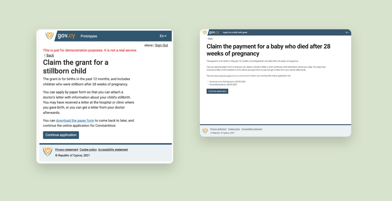
⏪ Before and after ⏩
Impact and outcomes
Replacing a high-error paper process
Before digitalisation, around 60% of paper applications had errors or required further information, sometimes leading to decisions taking up to three months, even in cases of rejection. The new service replaced the paper route for an estimated 85% of use cases. Clear start-page content, plain-language eligibility explanations, and well-signposted outcomes were essential in helping users understand early whether the service was right for them.
Faster outcomes through clarity and early filtering
By combining content-led upfront clarity with deep integration and early eligibility filtering, users could find out within minutes whether they were eligible, ineligible, or needed to apply via an alternative route. This reduced wasted effort and uncertainty, allowing users to ‘fail fast’ rather than wait weeks or months for a decision. In research, some users said they previously felt they needed help from a lawyer to complete the paper form – an indicator that clearer content reduced the comprehension barrier.
Early success metrics
In the first two months after launch, the service achieved a 71% completion rate, with an average transaction time of 4 minutes. For the administering body, this translated into an estimated 10-30 minutes saved per application, significantly reducing processing effort. Together, these outcomes point to the impact of clear, user-centred content in reducing both cognitive and administrative burden for users and the government department.